Choosing the Best Ink Colors for Your Design
Choosing your ink and shirt color is one of the fun parts of designing, however, it can also be a bit tricky. Sometimes, certain t-shirt/ink color combinations look more vibrant on a computer screen than they do in real life.
This is because lighting in the Lab is optimal (no shadows or dim light), and computer screens often have filters to make colors appear more vibrant. While this makes your daily computer use more visually exciting, it also means that colors, once printed, can appear different compared to what you see on your screen.
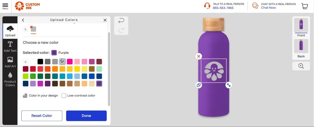
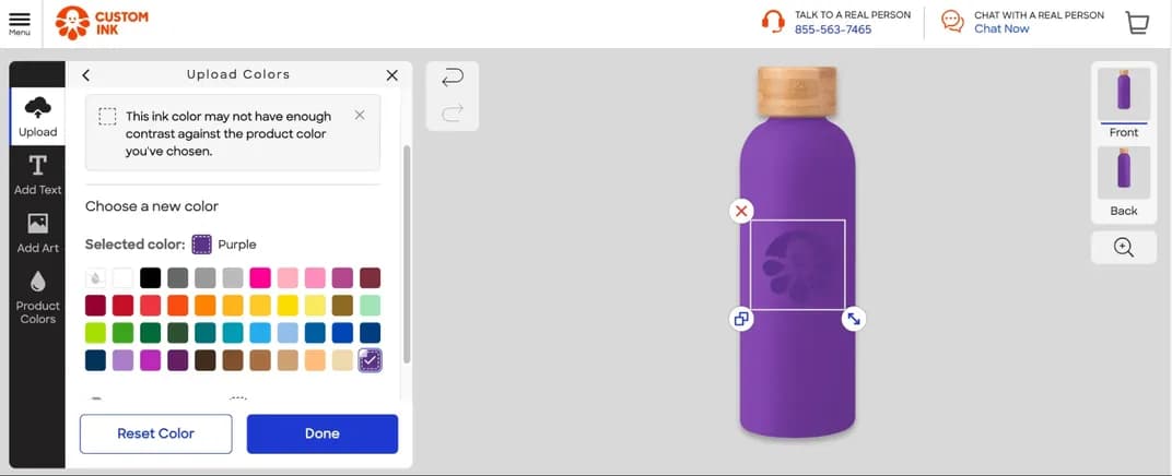
Don't worry, our Design Lab includes tools to help you determine when colors may not print vibrantly on the product color you choose!
- Low-contrast colors will be hidden from the color options menu
- You can still view these colors if you open the menu fully and will see a dotted line indicator if you choose a low-contrast color
- If you choose a low-contrast color from the options available, a message will appear.