Font of the Week — Archer
 Posted By Lissa Eckert —
Lissa has been helping customers create their perfect custom swag at Custom Ink since 2014 and loves to share her insights, tips, and tricks.
SHARE:


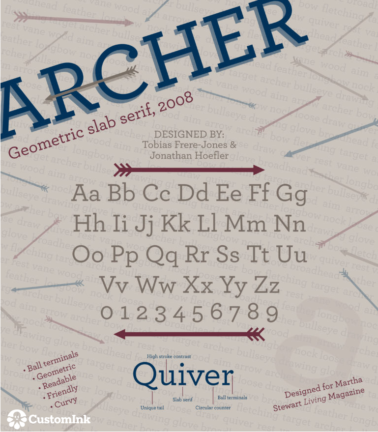
Archer, created in 2008, was designed by Tobias Frere-Jones and Jonathan Hoefler. Archer was originally designed specifically for use in Martha Stewart Living— the magazine wanted a “straightforward”, yet personable font, and Archer evolved into just that.
As described in the overview of Archer on Typography.com, Frere-Jones and Hoefler wanted to create a font that pulled from the “ordinary” world of traditional Antique fonts with the modern flair of Geometrics. Archer became a favorite for it’s fun take on a familiar style.
Our Font of the Week images are created by Emily Clark, an Expert Production Artist at CustomInk and a self-declared font addict. Font of the Week fuels Emily’s passion to research and learn more about beloved typefaces like Archer. What font should Emily feature next? Sound off in the comments below!

Lissa has been helping customers create their perfect custom swag at Custom Ink since 2014 and loves to share her insights, tips, and tricks.