Landscaping Shirt Design Ideas: Logos, Colors & Professional Branding
 Posted By Custom Ink Staff —
The Custom Ink Staff is a team of design enthusiasts and promo product experts dedicated to bringing your ideas to life. From screen printing secrets to the latest trends in custom gear, we draw on decades of collective experience to help you create something unforgettable.
SHARE:


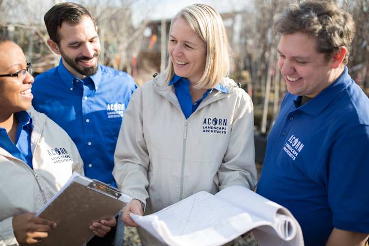
Your landscaping logo has about five seconds to make a homeowner trust your crew before you’ve said a word to them. PPAI’s consumer research on branded merchandise found that 57% of people remember a brand specifically because the logo was clear and visible, and nearly 90% say design plays a role in whether they keep or trust a branded item. For a landscaping business, that five-second window happens every time a crew member steps out of the truck.
This guide covers real landscaping logo ideas, the color psychology behind why some lawn care logos work and others don’t, and how to build a professional-looking uniform without hiring a branding agency.
In This Article
- Why Your Landscaping Logo Matters More Than You Think
- Color Psychology for Landscaping and Lawn Care Logos
- Landscaping Logo Ideas That Actually Work
- Logo Design Principles for Landscaping Companies
- What NOT to Do With Your Landscaping Logo
- Professional Uniforms on a Budget
- Frequently Asked Questions
Key Takeaways
- A clear, visible logo is what people actually remember: 57% of consumers say a clear logo is what made a branded item memorable, per PPAI’s consumer research.
- Green isn’t automatic: earth tones read as eco-friendly and established, but a bold accent color often does more for visibility on a work shirt than an all-green palette.
- Most business owners aren’t confident designing from scratch: only 41% of swag organizers say they enjoy design work and find it easy, per Custom Ink’s 2026 Unsung Heroes Survey, which is exactly why templates and design help exist.
Why Your Landscaping Logo Matters More Than You Think

A landscaping logo does more work than most business owners give it credit for. Your logo appears on the truck, invoice, yard sign, and the crew’s shirts, often all visible to the same homeowner within a single job. PPAI’s research found that 44% of consumers actually prefer subtle branding over big, bold logos, which runs counter to the instinct to make a logo as large as possible on a work shirt. The goal isn’t maximum size, it’s maximum clarity at a glance.
- Consistency across touchpoints: the same logo on the truck, shirt, and yard sign builds recognition faster than a great logo used inconsistently.
- Legibility at a glance: a homeowner sees your crew’s shirt from a distance or through a window, not up close.
- Trust before conversation: a clean, professional logo signals an established business before anyone talks to your crew.
Color Psychology for Landscaping and Lawn Care Logos
Green is the obvious choice for a landscaping logo, and there’s a reason it’s the industry default: it signals nature, growth, and eco-friendly practices immediately. But an all-green palette can also blend into the landscape you’re standing in, which is a real problem for a logo that needs to stand out on a shirt or yard sign from across a lawn. Earth tones (browns, deep greens, tans) come across as established and trustworthy, while a bright accent color like orange or yellow paired with green adds contrast that’s easier to spot at a distance.
- Green: the industry standard for eco-friendly, growth, and outdoor work. Best paired with a second color for contrast rather than used alone.
- Earth tones (brown, tan, deep green): read as established and grounded, a good fit for a company with years in business.
- Bright accent colors (orange, yellow, blue): improve visibility against grass and foliage and work well for a newer company trying to stand out.
- Black or navy with a green accent: reads as more premium and professional, a common choice for higher-end landscape design and hardscape companies.

“My kids were equally as excited as I when my new shirts came in! Looking forward to advertising my business as me and my crew mow and landscape this summer. ” – Bsolj22
Landscaping Logo Ideas That Actually Work
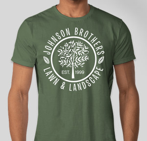
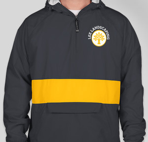
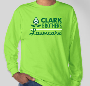
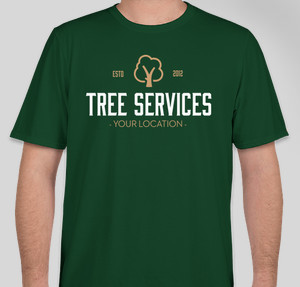
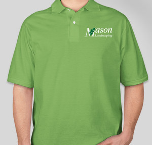
The strongest landscaping logos usually fall into one of three categories: a simple icon (a leaf, blade of grass, or tree), a name-forward wordmark, or a combination mark with a small icon next to the business name. You don’t have to start from a blank page. Our Design Lab includes dozens of landscaping-specific templates you can drop your own company name into and customize in minutes. Click on any of the below designs to get started.
Design Inspiration
Logo Design Principles for Landscaping Companies

A good landscaping logo works at every size, from a truck door to a small embroidered patch on a hat. Keep the design simple enough to read at a glance, choose no more than two or three colors, and make sure it still looks clean in a single color for embroidery. Your phone number and website belong on the shirt too, just not competing with the logo for attention.
- Left chest for the logo: the standard placement for both screen printing and embroidery, visible in any conversation.
- Full back for contact info: a large, simple company name and phone number that reads from across the street.
- Test it in one color: if your logo still looks good in solid black, it will hold up well for embroidery on hats and polos.
- Keep the wordmark legible: avoid scripts or overly stylized fonts that turn illegible at small sizes on a hat or sleeve.
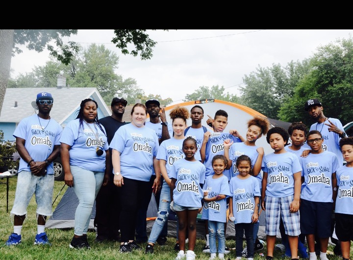
“The event was sponsored by myself and business ( Nice Lawn & Landscape ) and powered with the help of close friends and volunteers . Custom Ink has always been who I’ve trusted and ordered all my custom apparel from. I have recommended them to many people and have gotten a lot of compliments.”
Featured Product from This Story
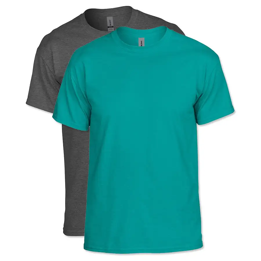
Gildan DryBlend 50/50 T-shirt
- 5.5 oz. 50/50 cotton/polyester with MVS Air spinning technology for reduced pilling and a smoother print surface
- Taped neck and shoulders, over 40 color options to match your logo palette
What NOT to Do With Your Landscaping Logo
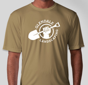
- Don’t use more than three colors. Extra colors add embroidery and printing cost without adding recognition.
- Don’t rely on a photo-realistic image. Detailed photo-style graphics lose clarity at small sizes and print poorly on fabric.
- Don’t cram in every service you offer. A logo is not a service list. Save “mowing, mulching, tree trimming, and more” for the back of the shirt or your website.
- Don’t skip the one-color test. A logo that only works in full color will look muddy or illegible when embroidered.
- Don’t change your logo every season. Consistency builds the recognition that a new design resets every time.
Professional Uniforms on a Budget

Designing a professional-looking custom workwear program doesn’t require a graphic designer on retainer, and most business owners feel exactly the hesitation you might be feeling right now.
Custom Ink’s 2026 Unsung Heroes Survey found that only 41% of people ordering custom apparel actually enjoy the design process and find it easy, with the rest either lacking time, struggling to execute their vision, or feeling intimidated by a blank canvas. Starting from a landscaping template solves most of that problem in one step.
- Start from a template, not a blank page: our design inspiration gallery has landscaping-specific layouts you can drop your business name into.
- Screen print for budget, embroider for premium: screen printing costs less for a large first order; embroidery holds up longer and reads as more polished on polos and hats.
- Order a sample first: confirm your logo looks right on fabric before committing to a full crew order.
- Ask for design help if you’re stuck: our design experts can turn a rough idea or an existing logo file into a print-ready design.
Frequently Asked Questions
Q: What colors work best for a landscaping logo?
Green remains the industry standard for signaling eco-friendly, outdoor work, but pairing it with a bright accent color like orange or yellow improves visibility against grass and foliage. Earth tones like brown and tan read as established and trustworthy.
Q: How do I make a landscaping logo without a designer?
Start from a real design template rather than a blank page. Our Design Lab has landscaping-specific templates you can customize with your own business name in minutes, and our design experts are available if you want a second set of eyes.
Q: Where should the logo go on a landscaping company shirt?
Left chest for the logo, full back for your company name and phone number. That combination keeps the shirt professional up close and readable from a distance.
Q: How many colors should a lawn care logo have?
Two to three colors maximum. More colors add printing and embroidery cost without improving recognition, and a logo that works in a single color will hold up best for embroidered hats and polos.
Q: Should I include my phone number on the logo itself?
No. Keep your phone number and website separate from the logo, typically on the back of the shirt in a large, simple font. Crowding the logo with contact information makes both harder to read.

The Custom Ink Staff is a team of design enthusiasts and promo product experts dedicated to bringing your ideas to life. From screen printing secrets to the latest trends in custom gear, we draw on decades of collective experience to help you create something unforgettable.