12 Common Business Card Mistakes & How to Avoid Them
 Posted By Miellyn Barrows —
Miellyn is the Director of Marketing Content at Custom Ink. Her work has spanned marketing for television networks like TLC and Travel, educational content for Smithsonian and National Geographic, marketing and story for indie video games, essays for publishers including Random House, The Telegraph, and Smart Pop Books, and stories for press outlets like VICE and VH1.
SHARE:


Bad business cards rarely fail loudly. Someone squints at the type, notices an old phone number or scans a QR code that goes nowhere, and the card goes in a drawer. The worst business cards share one trait: they make the reader do the work. The most common business card mistakes are typos, tiny type, outdated details, clutter and a missing next step. This guide covers 12 business card fails, with a quick fix for each, so your business cards are the ones people keep.
In This Article
- What Makes a Business Card Bad?
- 12 Business Card Mistakes and Fixes
- What to Put on a Business Card (and What to Skip)
- Do People Still Use Business Cards?
- Business Card Design Tips Before You Order
- Frequently Asked Questions
Key Takeaways
- 28% of organizers name design errors as their biggest worry when ordering custom gear (2026 Unsung Hero Survey). Typos and wrong details are the fails you cannot fix after printing.
- 30% worry that quality will look cheap in person (2026 Unsung Hero Survey). A card that feels flimsy hurts a good design, so stock matters as much as layout.
- Only 23% of adults in Great Britain have ever handed out a business card, per Ipsos (2024). Fewer cards in circulation means a bad one stands out, and so does a good one.
What Makes a Business Card Bad?
A bad business card is hard to read, wrong or forgettable. What makes a good business card is the opposite: it is easy to read, correct and distinctive. Bad business cards almost always fall into one of those three groups. This table shows the business card fails at a glance, and each one is explained below.
| # | Business card fail | Quick fix |
|---|---|---|
| 1 | Outdated style | Refresh colors, type and layout |
| 2 | Type too small or hard to read | Keep contact lines at 8 pt or larger |
| 3 | Too many fonts | Use two at most |
| 4 | Too many colors, or low contrast | Use two or three colors at a 4.5:1 ratio |
| 5 | Outdated information | Update details before every reorder |
| 6 | Typos | Have someone else check every digit |
| 7 | No way to contact you | Name plus one phone or email, at minimum |
| 8 | No website or next step | Add a web address or one clear action |
| 9 | Too much or too little information | Give each side one job |
| 10 | A QR code that won’t scan | Short link, clear border, test the proof |
| 11 | Artwork too close to the edge | Add bleed and keep text in the safe zone |
| 12 | Flimsy or forgettable | Choose thick stock and one standout idea |
12 Business Card Mistakes (and How to Fix Each One)
These business card design mistakes are grouped by the three ways a card goes wrong.
Hard to read
1. Outdated style. The design is the first thing people see. Dated colors, a tired typeface or a crowded layout suggest the rest of your business is dated too. Ask yourself if you would order this card today. If the answer is no, start from a modern template in our Design Lab.
2. Type too small or hard to read. The point of a card is to make contact easy. Shrinking the type to fit more on is the wrong fix. Keep contact lines at 8 pt or larger, and never go below 7 pt. Skip fancy script fonts for anything people have to read. Our guide to the best fonts for business cards lists safe sizes for every line.
3. Too many fonts. Unless you work for a circus, your card should not look like one. Two typefaces are plenty, one for your name and one for the details. A third rarely helps.
4. Too many colors, or low contrast. A rainbow pulls attention away from your contact details. Use two or three colors, and keep a 4.5:1 contrast ratio between text and background so the type stays readable in dim light. Light gray on white looks elegant on a screen and disappears on paper.
Wrong or missing
5. Outdated information. A new phone number or title makes a whole box of cards useless. Nobody wants to wait while you cross out the old number with a pen. If your details change often, order in smaller batches, and point people to a profile page you control.
6. Typos. Proofreading your own work is nearly impossible. In our 2026 Unsung Hero Survey of over 500 people who order custom gear, 28% named design errors as their biggest worry. Ask a friend to read the card, then check every detail yourself: call the phone number, send a test email and type the web address into a browser. Every order gets a free artist review, but only you can confirm that your name and number are right.
7. No way to contact you. A card without contact details is just a nice piece of paper. At a minimum, include your first and last name plus one phone number or email address.
8. No website or next step. If you have a website, print it. A web address lets people see your portfolio, services or booking page, none of which fit on a card. If you do not have a site, a simple page is easy to set up. Then give people one clear action, such as “Scan to book” or “Visit to see our work.”
9. Too much or too little information. Lay out everything you want to include, then take a break and look again. Is each item necessary? Is something missing? A useful rule is to give each side one job: the front says who you are, and the back says what to do next. See our 15 ideas for the back of a business card.
Print and tech fails
10. A QR code that won’t scan. A QR code is a shortcut only if it works. Common causes are a code that is too small, a missing border, a long link and a dark background. Denso Wave, the inventor of QR codes, requires a margin four modules wide around the code. Use a short link, print it about 0.8 inch square or larger, and scan the printed proof on an iPhone and an Android phone before you order. Our guide to QR code business cards walks through the steps.
11. Artwork too close to the edge. Cutting is never perfectly exact. Without bleed, a trimmed card can show a thin white edge. Extend background color 0.125 inch past the trim, and keep text 0.125 inch inside it. Our business card size guide shows the exact measurements, and this print shop guide to bleed explains the idea.
Forgettable
12. Flimsy or boring. The same survey found that 30% of organizers worry quality will look cheap in person. Thin stock and a plain layout make a card easy to forget. Choose heavy stock, then add one standout idea, such as rounded corners, a clever line or a useful back. Our Full Color 2″ x 3.5″ Horizontal Business Cards use 120# cardstock with a matte finish, and the aqueous coating on our paper cards adds scratch and scuff resistance. For inspiration, see our business card ideas.
What Should Be on a Business Card (and What Not to Put On It)?
What to put on a business card comes down to the information people need to reach you. A good business card has your name, title, company, one phone number or email, a web address and a logo. What not to put on a business card is just as important. This table covers the business card information to include and skip.
| Put it on | Leave it off |
|---|---|
| Your name and title | Five social handles you rarely check |
| One phone number or email you answer | Several numbers, including ones you ignore |
| Your website or one clear action | A long mission statement |
| A logo, sized to print cleanly | Clip art and multiple logos |
| A short tagline, if it earns its place | Old titles, certifications or addresses |
Our complete guide to making business cards covers what to include in more depth.
Do People Still Use Business Cards?
Yes, though not everyone. An Ipsos poll of 1,089 adults in Great Britain (January 2024) found that only 23% have ever handed out a physical business card. But 47% of current users aged 16 to 34 expect to keep using them, so business cards are still relevant for people who network in person. The poll covers Great Britain only, so treat it as a direction rather than a US figure. Because fewer people hand them out, a bad card stands out more, and so does a good one.
Many people pair a paper card with a digital one. Our guide to digital and NFC business cards explains how that works.
Business Card Design Tips Before You Order
Use these business card design tips as a final check. They also cover basic business card etiquette: hand over a card that is clean, correct and easy to read.
- Proof it twice. Read every digit aloud. Then ask someone else to read it.
- Print it at actual size. If you cannot read it at arm’s length, enlarge it.
- Check the safe zone. Keep all text and codes 0.125 inch inside the trim.
- Test anything scannable. Scan the printed QR code with two phones.
- Pick the right size. A standard card is 2″ H x 3.5″ W. See our size guide for options.
- Get a second opinion. Every order includes a free artist review, and our design experts can help with your design.
These formats are a good place to start. Each lists double-sided printing, so the back can do its own job.
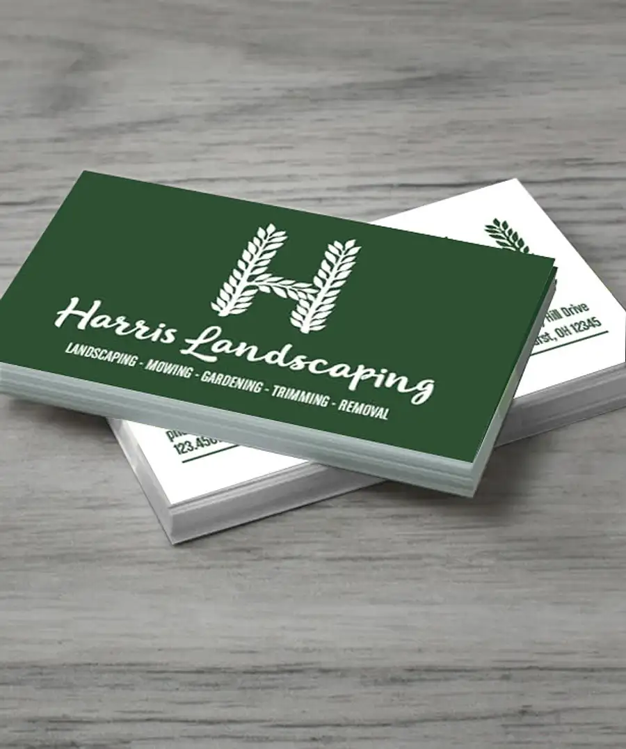
Full Color 2″ x 3.5″ Horizontal Business Cards: Classic
- 120# cardstock, matte finish
- Double-sided printing available; minimum 100
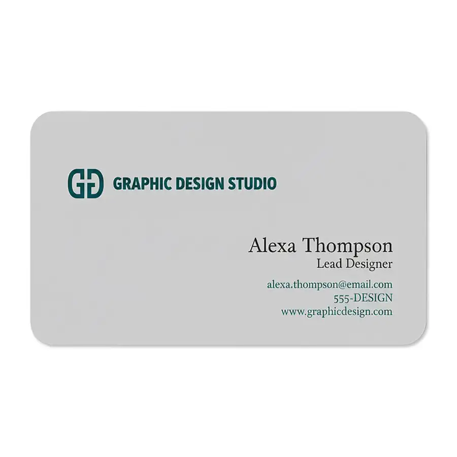
Full Color 2″ x 3.5″ Horizontal Rounded Corner Business Cards: Softer
- 120# cardstock, matte finish, aqueous coating
- Double-sided printing available; minimum 100
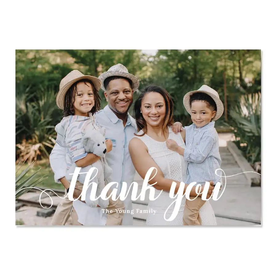
Full Color 4.25″ x 6″ Flat Card: Roomy
- 4.25″ x 6″; 120# cardstock, matte finish
- Double-sided printing available; minimum 100
Frequently Asked Questions
Q: What are the most common business card mistakes?
The most common business card mistakes are typos, type that is too small, outdated information, too many fonts or colors, and a missing next step such as a website or QR code that works.
Q: What makes a bad business card?
A bad business card is hard to read, wrong or forgettable. Tiny type, low contrast, errors and thin stock are the usual causes.
Q: What should you not put on a business card?
Leave off clutter: several phone numbers, a pile of social handles, long mission statements, clip art and anything out of date. Keep the card to what helps someone contact you.
Q: Do people still use business cards?
Yes. An Ipsos poll of adults in Great Britain found 23% have handed one out, and 47% of current users aged 16 to 34 expect to keep using them. They matter most when you meet people in person.
Q: What font size should a business card use?
Keep contact lines at 8 pt or larger, and never go below 7 pt. Set your name larger than everything else.
Q: How do I proofread a business card?
Read every digit aloud, call the phone number, email the address and type the web address into a browser. Then have someone else check it.
More Custom Ink News & Events

Miellyn is the Director of Marketing Content at Custom Ink. Her work has spanned marketing for television networks like TLC and Travel, educational content for Smithsonian and National Geographic, marketing and story for indie video games, essays for publishers including Random House, The Telegraph, and Smart Pop Books, and stories for press outlets like VICE and VH1.