Vintage T-Shirts: How to Design a Throwback Tee That Actually Looks Old
 Posted By Custom Ink Staff —
The Custom Ink Staff is a team of design enthusiasts and promo product experts dedicated to bringing your ideas to life. From screen printing secrets to the latest trends in custom gear, we draw on decades of collective experience to help you create something unforgettable.
SHARE:


A brand new shirt can look decades old before anyone even washes it. In Custom Ink’s 2026 Swag Trends Survey, half of respondents said they want the softer, washed-out look of garment-dyed apparel over standard bright colors. That is not a coincidence. Vintage t-shirts are having a real moment.
Getting the look right comes down to three choices: the blank you print on, the palette you choose, and the decade you are pulling from.
This guide walks through how to design custom shirts with an authentic vintage feel, decade by decade.
In This Article
- What Makes a T-Shirt Actually Look Vintage
- Picking a Vintage-Inspired Blank
- Decade-by-Decade Style Guide
- Design Tips for an Authentic Retro Look
- Frequently Asked Questions
Key Takeaways
- 50% of buyers want the garment-dyed look, according to Custom Ink’s 2026 Swag Trends Survey. A pigment-dyed blank does more work than any ink effect.
- The blank matters as much as the graphic. A Comfort Colors 1717 (6.1 oz., garment-dyed) reads as lived-in straight out of the package.
- Retro is trending toward reinterpretation, not replication, per ASI’s 2026 apparel trend coverage. Think bold colorblocking and varsity details, not exact decade recreations.
What Makes a T-Shirt Actually Look Vintage
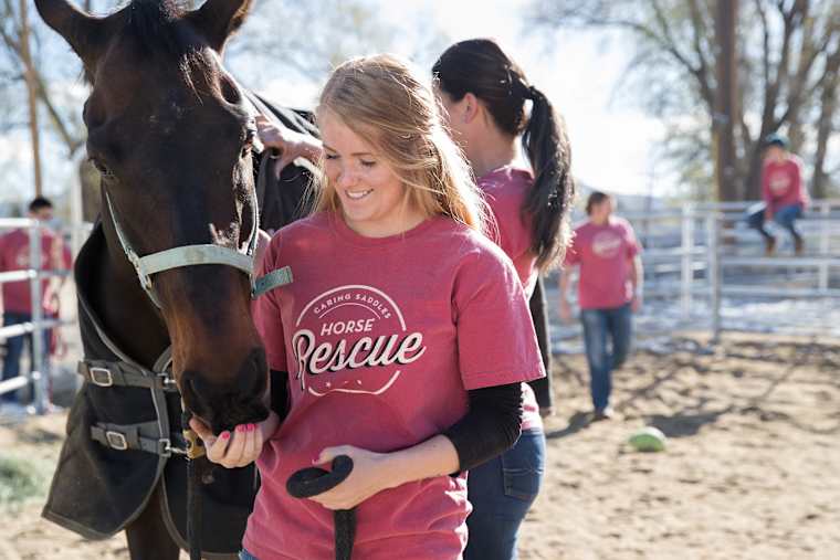
A worn-in look comes from three things working together: fabric treatment, color, and graphic style. Skip any one of them and a design just reads as a plain shirt with a retro font.
- Garment dye or pigment dye: Blanks like Comfort Colors are dyed after the shirt is sewn. That creates the soft, slightly uneven color that reads as lived-in from day one.
- Muted, faded color palettes: True vintage tees rarely use pure black or bright white ink. Faded reds, mustard, olive, and washed navy all signal age.
- Distressed print effects: A cracked or slightly faded ink texture on the graphic itself mimics decades of washing, without actually aging the shirt.
ASI’s coverage of apparel trends backs this up: suppliers describe today’s retro apparel as reinterpretation, not exact replication. Think bold color-blocking and varsity stripes updated for a modern fit, not a costume-accurate reproduction of an actual 1985 shirt.
Picking a Vintage-Inspired Blank Shirt
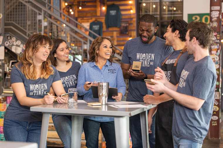
Your blank custom t-shirt does most of the visual work before a single ink color goes down. Here is how the three most common vintage-style blanks actually compare.
| Blank | Weight | Fabric | Vintage Feature |
|---|---|---|---|
| Comfort Colors 100% Cotton | 6.1 oz. | 100% ringspun cotton | Garment-dyed after sewing for a soft, lived-in feel from day one |
| Next Level Ringer T-shirt | 4.3 oz. | 100% combed ring-spun cotton fine jersey | Contrast collar and cuffs, a classic 70s and 80s silhouette |
| Next Level Tri-Blend T-shirt | 4.3 oz. | 50% polyester, 25% combed ring-spun cotton, 25% rayon | Soft, broken-in hand feel straight out of the package |
If your design leans tie-dye or festival-era ’70s, our retro and vintage clothing collection also carries ringer tees built specifically for that look.
Customer Story: Groovy From Head to Toe
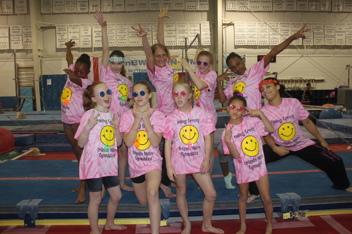
“Our Regional Meet has a theme every year, this year was the 60’s, 70’s, and 80’s. The girls dress up and wear their gear when they are announced.” – Orlando Metro Gymnastic
Featured Product from This Story
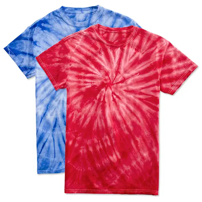
Dyenomite 100% Cotton Tonal Tie-Dye T-shirt
- 100% cotton, hand tied and tinted with colorfast dyes
- Each shirt’s pattern is unique due to the hand-dye process
- Available for kids, teens, and adults
Your Decade-by-Decade Vintage Style Guide

Each decade has its own visual shorthand. Borrowing the right details makes a design read as intentional, not generic.
70s: Groovy and Earth-Toned
Think tie-dye, psychedelic swirls, and rounded, bubbly lettering. Color palettes lean toward mustard, burnt orange, olive, and brown rather than bright primaries.
- Best for: Reunions, festivals, and anniversary tees for a business founded in the 60s or 70s.
- Typography: Rounded, groovy script or bubble letters.
- Pro tip: A tie-dye blank does the color work for you, so keep your graphic to one or two ink colors.
80s: Bold and Geometric
The 80s favor neon brights, sharp geometric shapes, and arcade-inspired graphics. Contrast is the whole point, think hot pink against black or electric blue against white.
- Best for: Throwback nights, class reunions, and retro-themed fundraisers.
- Typography: Bold, blocky sans-serif or a chrome and neon lettering effect.
- Pro tip: Pair neon ink with a heather grey blank so the colors pop without overwhelming the shirt.
90s: Grunge and Varsity
Boxy cuts, varsity stripes, and grunge-inspired distressed graphics define the decade. ASI’s 2026 apparel trend coverage points to boxy cuts nodding directly to the 90s and Y2K, alongside drop-sleeves and heavier fabrics.
- Best for: Sorority and fraternity rush events, school spirit weeks, and pop culture throwback nights.
- Typography: Varsity block letters, grunge-textured stencils, or a boy-band tour-style layout.
- Pro tip: A ringer tee’s contrast collar naturally reads as 90s without any extra design work.
Design Templates to Start From
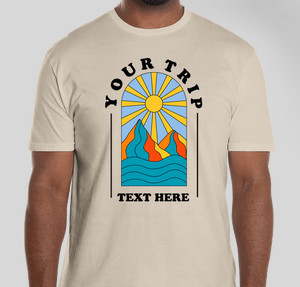
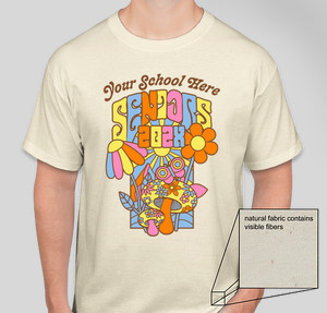
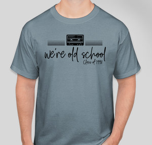
Design Tips for an Authentic Retro Look
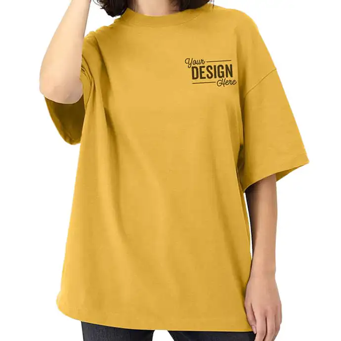
A few small choices separate a genuinely vintage-feeling design from one that just says “retro” in the file name. Browse our template library to get started witih retro designs for your custom t-shirts.
- Skip pure black and white ink: Faded charcoal or cream reads far more authentic than true black or white.
- Use a distressed print texture: A slightly cracked or worn ink effect on the graphic does more than fabric treatment alone.
- Keep the layout simple: Most genuinely old tees have one central graphic, not a busy, multi-element design.
- Match your ink to your decade: Earth tones for the 70s, neon for the 80s, and muted grunge tones for the 90s.
Customer Story: A 90s Throwback Done Right

“This year’s show had a ’90s Boy Band theme that brought us all back to the good ol’ days. We raised over $4,000 total during the event which went to charities and student scholarships.”
Popular Products for Your Vintage Design
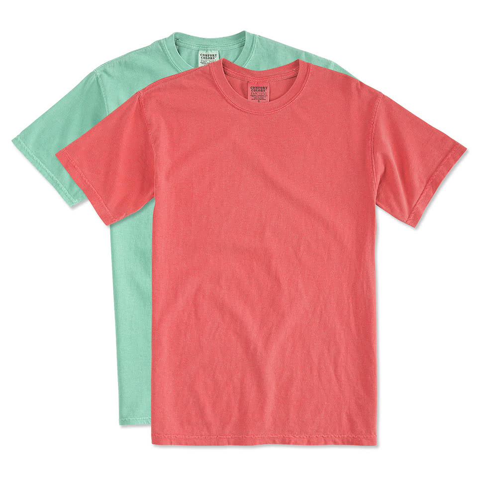
Comfort Colors 100% Cotton T-shirt
- 6.1 oz. 100% ringspun cotton
- Garment dyed for a lived-in feel and almost no shrinkage
- Relaxed fit, available S to 4XL
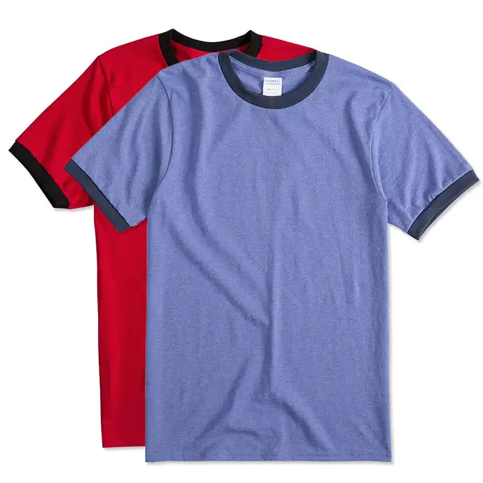
Port & Company Ringer T-shirt
- 100% cotton with a contrasting collar and sleeve trim
- Double-needle stitching for durability
- Available S to 4XL
Once your design is locked in, our Design Lab lets you preview it on any blank before you order, so you can see exactly how the ink color reads against a garment-dyed or heathered shirt.
Frequently Asked Questions
Q: How do I make custom vintage t-shirts look actually worn-in?
Start with a garment-dyed blank like Comfort Colors, then use a faded or slightly distressed ink texture on your graphic. The fabric treatment does most of the work before the print even goes on.
Q: What is the difference between vintage t-shirts and retro t-shirts?
Vintage usually implies an actual older garment or a design meant to look aged. Retro refers to a style borrowed from a past decade on a brand new shirt. In practice, both terms describe the same custom design approach.
Q: What t-shirt color works best for a 70s-style design?
Earth tones like mustard, olive, and burnt orange, or a tie-dye blank, capture the decade best. Avoid pure white or black, which read as too modern.
Q: Can I order just one custom vintage t-shirt, or does my group need a minimum?
Many of our vintage-style blanks have no minimum. You can order a single shirt or a large group run of the same design.
Q: Can my group pay separately for our retro t-shirts?
Yes. Our Group Order Form lets each person pick their size and pay on their own, or you can cover the whole order at once.
Q: Can I get design help creating a vintage graphic tee?
Absolutely. Our design experts can help with color and typography choices at no extra cost. Our retro design templates also give you a decade-specific starting point.

The Custom Ink Staff is a team of design enthusiasts and promo product experts dedicated to bringing your ideas to life. From screen printing secrets to the latest trends in custom gear, we draw on decades of collective experience to help you create something unforgettable.