How to Create Your Own Custom Graphic Tees: A Step-by-Step Design Guide
 Posted By Custom Ink Staff —
The Custom Ink Staff is a team of design enthusiasts and promo product experts dedicated to bringing your ideas to life. From screen printing secrets to the latest trends in custom gear, we draw on decades of collective experience to help you create something unforgettable.
SHARE:


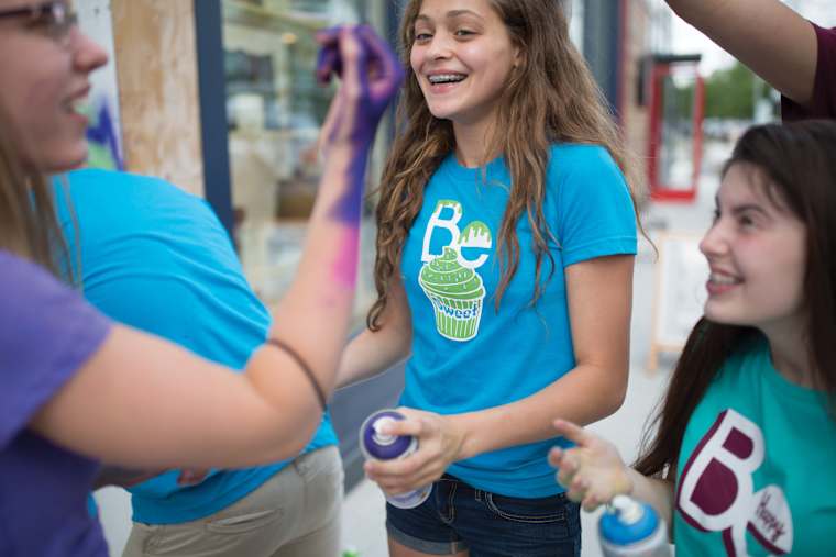
There is a reason graphic tees dominate the custom apparel world.
Unlike a small chest logo, a graphic t-shirt tells a story, captures a moment, or showcases personal style. According to Grand View Research, the global custom t-shirts market is on track to nearly double to $9.82 billion by 2030, with graphic tees leading the way.
The challenge is that a design created on a bright screen doesn’t always print the way you expect. Subtle color gradients can flatten out, thin fonts can lose their crispness, and shirt placement can make or break the overall look.
This guide is your roadmap for getting your custom shirts right the first time. We’ll break down how to create compelling graphics that hold up in print, covering typography best practices, color theory, licensing considerations, and how to choose the best print method for your specific design.
In This Article
- 2026 Graphic Tee Trends
- Typography That Actually Works on a Shirt
- Color Theory for Graphic Tees
- What You Can and Can’t Print: Licensing Basics
- Choosing Your Blank
- Matching Your Design to a Printing Method
- Frequently Asked Questions
Key Takeaways
- Aim for at least 70% contrast between your design and the shirt color. Low contrast is the single most common reason a DIY graphic tee design fails to read from a distance.
- 28% of people organizing custom apparel say design errors are their biggest fear. Per Custom Ink’s 2026 Swag Organizer Survey, that beats concerns about late delivery or the wrong sizes.
- Vector art unlocks screen printing; a 300 DPI file unlocks digital printing. Knowing which one you have determines which printing method is actually available to you.
2026 Graphic Tee Trends: What’s Working Right Now
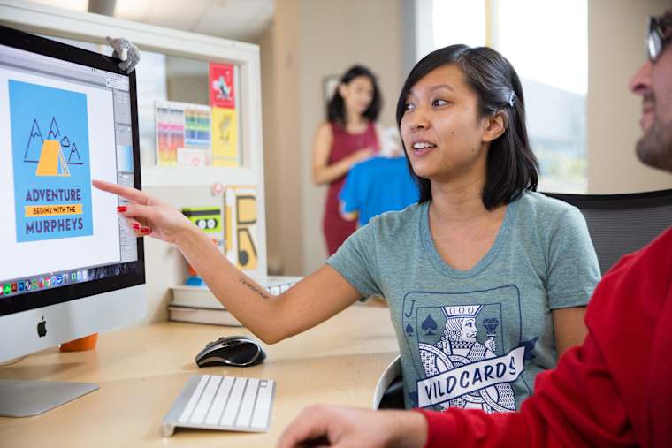
A few looks are dominating custom tees right now, and they lean toward restraint over clutter.
- Minimalist single-line text: One short phrase, one clean font, nothing else. It ages better than illustration-heavy designs and works for funny shirts and serious ones alike.
- Oversized front graphics: A large, bold image that reads clearly from across a room, common on streetwear-inspired tees.
- Back prints: Moving the main graphic to the back reads as more intentional than a small front-chest logo.
- Vintage and distressed looks: Faded ink and garment-dyed blanks that read as already worn in. Our vintage and retro t-shirt guide covers this style in depth.
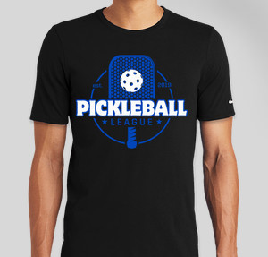
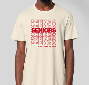
Design Templates to Start From
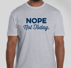
Typography That Works Well on a Graphic T-Shirt
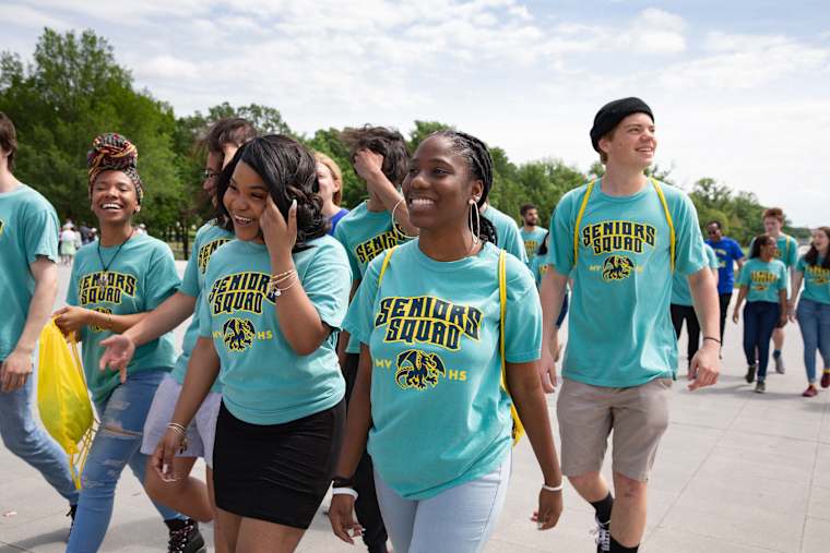
The biggest difference between a design on a screen and a t-shirt is distance. On a screen, people read from a few inches away. On a shirt, they’re reading it from across the room.
A few easy tricks will keep your text looking sharp instead of messy:
- Stick to two fonts max. Pick one bold font for your main phrase, and maybe a simple secondary one for smaller details like a date or location. Any more than that starts looking cluttered and amateur.
- Give the letters some breathing room. Super thin, fancy, or crowded scripts might look pretty on Pinterest, but on a cotton shirt, they become blurry. Choose fonts with clean, open lines.
- Don’t make it too big or too small. A standard front design is usually about 10 to 12 inches wide, starting about three fingers below the collar. That keeps the text sitting naturally across the chest without wrapping under your armpits.
- Keep your lines reasonably thick. Tiny, razor-thin letters can get lost in the weave of the shirt or peel over time. As a rule of thumb, make sure your smallest letters are at least as tall as a pencil eraser.
Customer Story: A One-Line Joke, Perfectly Sized

“We surprised the birthday boy with these Custom Ink shirts that read ’40 is the new 40.’ We have a great group of friends that have been friends for 20+ years.” – Genaro’s 40th
Featured Product from This Story
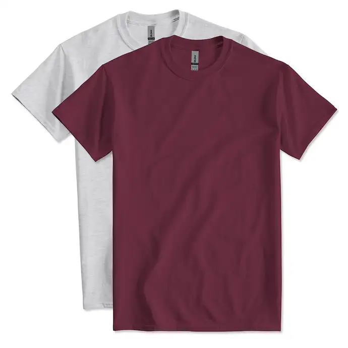
Gildan Ultra Cotton T-shirt
- 6 oz. 100% pre-shrunk cotton
- Double-needle stitched crewneck for durability
- Over 50 colors, sizes for kids, teens, and adults
Color Theory 101 for Graphic Tee Designs
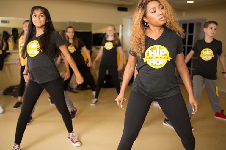
Color is usually where DIY designs trip people up, but getting it right comes down to a few basic rules of thumb:
- Contrast against the shirt: Aim for at least 70% contrast between your ink and the garment color. Navy ink on a dark shirt disappears no matter how good the design is. White ink on a black graphic tee is the most reliable combination there is.
- Ink count has a real cost: In screen printing, every color is a separate screen with its own setup cost, typically $15 to $30. Most designs stick to one to three colors to keep pricing reasonable.
- RGB is not print: Your screen displays backlit RGB colors that look more vibrant than ink ever will. Print colors are matched to Pantone or spot-color systems instead, so expect some muting once a bright screen color hits fabric.
What You Can and Can’t Print: Licensing Basics
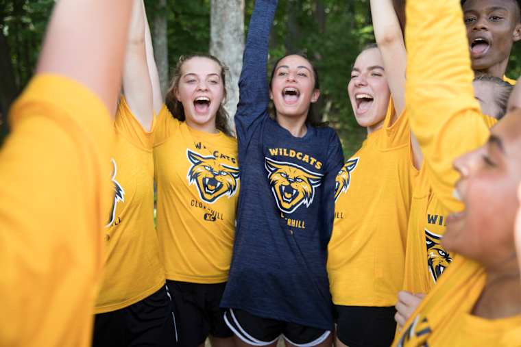
In Custom Ink’s 2026 Swag Organizer Survey, 28% of people organizing custom apparel say design errors are their biggest fear, ahead of late delivery or wrong sizes. Licensing mistakes are one of the costliest versions of that fear. It’s worth understanding the basics before you commit to a design.
- Copyright protects creative work: Illustrations, characters, and artwork are protected automatically once created, even if you redraw them yourself.
- Trademark protects brand identity: Sports team logos, band logos, and celebrity likenesses fall here. Selling a shirt with someone else’s logo is commercial use, even if wearing one yourself is fine.
- “Bootleg” style is legal; the actual logo usually is not: You can borrow the aesthetic of a bootleg band tee. Reprinting the real logo or photo without a license is a different matter.
- Where to find safe assets: Public-domain and royalty-free libraries, along with Google Fonts, are a good starting point. When in doubt, draw it yourself.
This is general information, not legal advice. For anything you plan to sell commercially, a quick trademark search at USPTO.gov or a conversation with an attorney is worth the time.
Choosing the Right Shirt (the Blank)

The shirt you print on matters just as much as the graphic itself. A great design on a stiff, scratchy t-shirt usually ends up sitting in the back of the closet, while a soft, well-fitting tee gets worn every week.
When you’re picking a shirt — often called “the blank” — keep these three popular t-shirt styles in mind, depending on the vibe you want and what you’re looking to spend:
| Blank | Weight | Fabric | Best For |
|---|---|---|---|
| Gildan Softstyle | 4.5 oz. | 100% ring-spun cotton | Everyday soft basics, budget-friendly |
| Bella+Canvas Jersey | 4.2 oz. | 100% pre-shrunk combed ringspun cotton | Supersoft, retail-quality feel, smooth print surface |
| Comfort Colors 100% Cotton | 6.1 oz. | 100% ringspun cotton, garment-dyed | Heavyweight, vintage-look designs |
Matching Your Design to a Printing Method
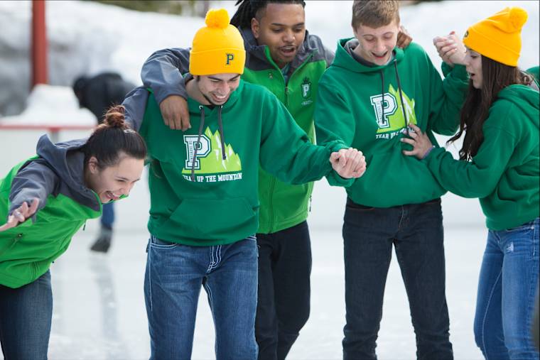
Depending on how many shirts you need and how detailed your design is, your artwork will usually be printed in one of three ways, and your file format decides which printing method is actually available to you.
| Method | Best For | File Needs |
|---|---|---|
| Screen printing | Bold graphics, solid-color designs, larger orders | Vector file (like an .AI, .EPS, or clean .SVG) with 1 to 3 solid spot colors |
| Digital printing (DTG/DTF) | Full-color, photographic, or gradient designs | High-res image (PNG or JPEG) at 300 DPI so details stay crisp on cotton |
| Heat transfer vinyl | Simple text, names, and numbers | Vector cut file, letters at least 0.5 inches tall |
If your design is bold with a couple of solid colors and you are ordering in bulk, screen printing usually costs less per shirt. If it is detailed or photographic, or you only need a handful, digital printing is the better fit. Our screen printing guide goes deeper on how that process works.
Once your file is ready, our Design Lab shows you exactly how it will look on the shirt color you pick, before you commit to an order.
Frequently Asked Questions
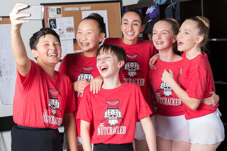
Q: What is a graphic tee?
A graphic tee is a t-shirt built around a design, whether that’s text, an illustration, a photo, or a mix. The graphic is the point of the shirt, not an afterthought.
Q: How do I create custom graphic tees if I’m not a designer?
Start from a template instead of a blank canvas. Our Design Lab includes editable templates and a clipart library, and our design experts can help refine a rough idea at no extra cost.
Q: How do I design graphic tees for different occasions?
A minimalist single-line design reads as more versatile than a busy graphic, and works for both funny shirts and understated ones. Save bold, oversized graphics for casual, event-specific wear.
Q: Are cheap graphic tees lower quality?
Not necessarily. A budget-friendly blank t-shirt like Gildan Softstyle holds a print well. Price differences usually come down to fabric weight and finishing, not print quality.
Q: Can I put a copyrighted logo on a custom graphic tee?
Not for anything you plan to sell. Wearing a shirt with a team or band logo yourself is generally fine, but printing and selling that logo without a license is a trademark or copyright issue.
Q: Is there a minimum order for custom graphic tees?
Many of our styles have no minimum, so you can order a single shirt or a large batch using the same design.

The Custom Ink Staff is a team of design enthusiasts and promo product experts dedicated to bringing your ideas to life. From screen printing secrets to the latest trends in custom gear, we draw on decades of collective experience to help you create something unforgettable.