T-Shirt Design Masterclass: Best Fonts & Tips for Team Apparel
 Posted By Custom Ink Staff —
The Custom Ink Staff is a team of design enthusiasts and promo product experts dedicated to bringing your ideas to life. From screen printing secrets to the latest trends in custom gear, we draw on decades of collective experience to help you create something unforgettable.
SHARE:


We’ve helped groups order custom t-shirts for everything from startup kickoffs to state championship runs. The orders that come back with reorders every year share one thing: the design is something people actually want to wear.
According to PPAI’s 2024 U.S. Distributor Sales Volume Report, apparel is the largest product category in promotional products, accounting for more than a quarter of all category sales. The irony is that most design guides skip the two decisions that most determine wearability: font choice and logo placement. This post covers both, with comparison tables, manufacturer specs, and real examples from teams who got it right.
In This Article
- Why Font Choice Makes or Breaks Team Shirts
- Best Fonts for T-Shirt Printing by Use Case
- Where to Put Your Logo on a Shirt
- Design Tips for Shirts the Whole Team Will Actually Wear
- Frequently Asked Questions
Key Takeaways
- Wearability is the only metric that matters. Our 2026 Swag Trends Survey found 67% of organizers define success only when recipients voluntarily wear the shirt, so a design decision is a business decision.
- Two fonts, always. Use one bold display font for the headline, one clean sans-serif for names and supporting text. Three or more fonts compete and the shirt looks cluttered at distance.
- Left chest plus full back covers 90% of use cases. A 3 to 4 inch left-chest mark for the brand, a 10 to 12 inch back for the message. Our design team recommends this combo for company orders and event tees alike.
Why Font Choice Makes or Breaks Team Shirts

A custom t-shirt carries your group’s brand at every coffee run, every game day, every airport hall. Font choice decides whether that message lands in two seconds or disappears in the visual noise.
The wrong typeface, regardless of how good the artwork is, creates a shirt that reads as an afterthought. Thin scripts at small sizes can crack after washing. Decorative display fonts set in body sizes become illegible from six feet away. And any font with hairline strokes will partially fill in when pushed through a screen printing mesh on a textured cotton weave.
The table below maps font categories to performance on the two variables that matter most: how well they read at distance and how reliably they reproduce through both screen printing and digital printing. Use it as your first filter before choosing a specific typeface in our Design Lab.
| Font Type | Best For | Reads at 20 Feet | Screen Printing | Digital Printing | Classic Examples |
|---|---|---|---|---|---|
| Bold Sans-Serif (Display) | Sports, slogans, streetwear | Excellent | Excellent | Excellent | Bebas Neue, Impact, Anton |
| Neutral Sans-Serif (Body) | Corporate, staff shirts, names | Very Good | Excellent | Excellent | Montserrat, Open Sans, Lato |
| Slab Serif | Athletics, varsity, collegiate | Excellent | Excellent | Excellent | Rockwell, Roboto Slab |
| Transitional Serif | Heritage, alumni, vintage | Good | Good (avoid hairlines) | Excellent | Georgia, Abril Fatface |
| Script / Handwritten | Reunions, casual events | Fair (size up) | Fair (no thin strokes) | Very Good | Pacifico, Lobster, Amatic SC |
Our design experts review the artwork on every order before it goes to production, and font legibility is one of the first things they check.
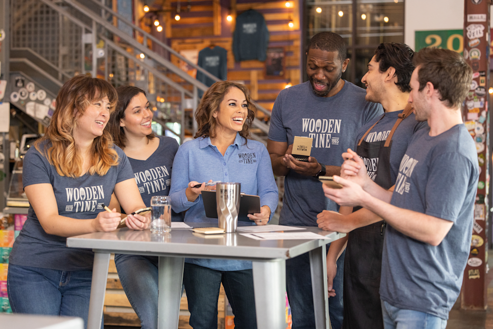
When Alarm.com’s Customer Experience Team came to us for shirts celebrating Customer Experience Day, the design combined word art inside their department logo. That kind of layered typographic design only works when the primary font is bold enough to anchor the composition and the secondary text is set at a size that survives the printing process.
Customer Story: Alarm.com Customer Experience Team

“We’re a newer team at Alarm.com and as we grow, we wanted something to signify our unity and focus on our dealer and end-user experiences. We celebrated Customer Experience Day by taking all of the descriptions used to identify an exceptional experience and made a word art bubble with those words in the image of our CXT’s logo. My original artwork color choices would NOT have looked as nice as the one that was edited and sent to me.”
Featured Apparel from This Story
Bella + Canvas Tri-Blend T-shirt
- Fabric: 3.8 oz., 50% polyester / 25% combed ring-spun cotton / 25% rayon
- Sizes: YS to 4XL
- Why it works for text-heavy designs: The tri-blend weave creates a subtle heathered texture that gives word art designs visual depth without fighting the typography
Design Templates to Start From
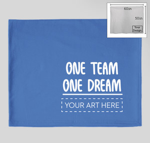
One Team One Dream
Bold display sans-serif, company team use
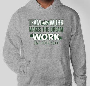
Teamwork
Neutral sans-serif, works for any group size
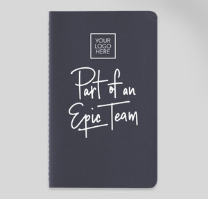
Part of an Epic Team
Display sans-serif ready for company colors
Best Fonts for T-Shirt Printing by Use Case
The font that looks perfect on a lacrosse jersey looks out of place on a law firm retreat shirt. Matching typeface to context is the single fastest way to go from “design we approved” to “design we love.” Below are the font families and pairings we recommend most often across the groups we work with, all available in the Design Lab.
Team Sports
Primary font: Bebas Neue or Impact. Both read clearly across a field or gym floor and reproduce cleanly on jerseys, performance tees, and hoodies.
Pairing font: Anton or Oswald, condensed sans-serifs that fit longer surnames in the name-and-number format without cramping. The visual rule here is tall and narrow: a condensed all-caps stack reads like a uniform, not a poster.
Custom Ink has over 600 sports team design templates to help you get started.
Corporate and Company Shirts
Primary font: Montserrat Bold or Helvetica Bold. Both feel contemporary, translate well to embroidery and screen printing alike, and scale cleanly to a 3-inch left-chest logo.
Pairing font: Open Sans Regular or Lato for taglines, event dates, or web addresses below the main mark. Keep the supporting text no smaller than 0.25 inches on the shirt so it survives a wash cycle without cracking.
Need inspo? Explore our most popular professionally designed business templates now.
Casual Events and Reunions
Primary font: Pacifico or Lobster. Both are friendly, approachable script fonts that suit family reunions, bachelorette weekends, and milestone birthdays.
Pairing font: Amatic SC or Caveat, hand-lettered complementary styles that keep the casual energy consistent.
One important rule: bump every script font up a size larger than you think you need. Script typefaces have thinner strokes that read smaller than their nominal size suggests, and anything under 0.25 inches printed height risks losing detail at the press.
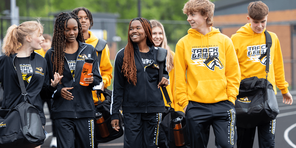
School and Youth Groups
Primary font: Rockwell or Roboto Slab. Both have the sturdy slab serifs that define the collegiate varsity look without tipping into retro costume territory.
Pairing font: Bebas Neue or Montserrat for class years and mascot names beneath the main graphic.
Schools that run a recurring spirit wear program are more than twice as likely to report higher-than-expected event attendance (33% vs. 14%) compared to schools without one, per our 2026 School Spirit Gap Survey. A consistent font system, reused year over year, is part of how that identity compounds.
Customer Story: Beachfront Baby Executive Team

“Beachfront Baby introduced a gorgeous new color of fabric to add to our line of baby carriers to wear in the water. The New Color Reveal party took place at Go Baby Go, San Antonio’s natural parenting boutique. There was food, fun & lots of babies, and the Beachfront Baby team looked sharp in our Custom Ink t-shirts with our logo. Custom Ink made designing our shirts so easy & affordable & the quality is very professional! We recently ordered more of this same design to hand out at an upcoming trade show and love how easy orders are to place and how quickly they are received!”
Featured Apparel from This Story
Gildan Ultra Cotton T-shirt
- Classic width, rib collar
- Taped neck and shoulders for comfort and durability
- Classic fit, seamless body
- High-performing black recycled tear-away label
- Proud member of the U.S. Cotton Trust Protocol
- Certified by Cotton USA
- Made with OEKO-TEX certified low-impact dyes
Design Templates by Sport and Group
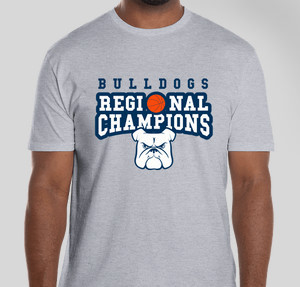
Bulldogs Basketball
Slab serif pairing, school athletics
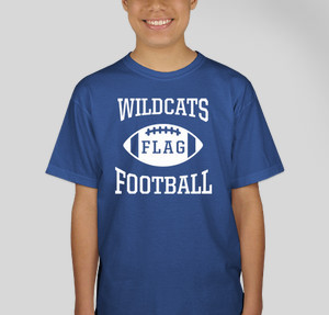
Flag Football
Display sans-serif, rec leagues and intramurals
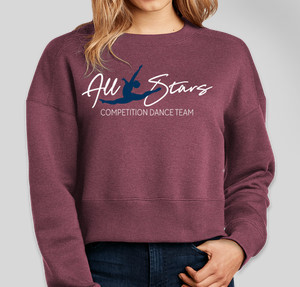
All Stars Competition Dance
Script plus bold sans-serif, performance groups
Where to Put Your Logo on a Shirt
Placement decides how your shirt is read. A 3-inch mark on the left chest reads as a uniform. A 12-inch graphic across the back reads as a statement. The same logo, placed differently, sends a completely different message. We see five placements cover nearly every team order, and the right one depends on your use case, not just aesthetics.
| Placement | Best Use Case | Recommended Size | Pros | Cons |
|---|---|---|---|---|
| Left Chest | Company uniforms, staff shirts, polos | 3–4 inches wide | Professional, brand-forward, versatile | Limited detail; too small for complex art |
| Center / Full Front | Event tees, slogans, spirit wear | 10–12 inches wide | High visibility, bold statement | Can crowd out pocket or zipper on performance cuts |
| Full Back | Player numbers, sponsor names, cause messaging | 10–14 inches wide | Maximum surface area, strong in photos | Hidden when seated; needs a front mark to anchor the shirt |
| Back Yoke | Tagline, team name, secondary brand | 2–3 inches wide | Eye-level when standing in a line, pairs with full back | Too small for detailed art or more than two words |
| Sleeve | Event dates, sponsor logos, secondary branding | 1–4 inches wide | Visible from the side; modern look | Curved surface limits fine detail reproduction |
The placement that drives voluntary wear is typically the combo: left-chest brand mark plus full-back message. Our 2026 Swag Trends Survey found 45% of corporate organizers now cite longevity as the most important factor when choosing branded apparel, above price and color options. A shirt designed for longevity has a logo placement that doesn’t look dated in three years. The left chest has stayed the professional standard for decades for exactly that reason.
Three Shirts That Handle Different Placements Well
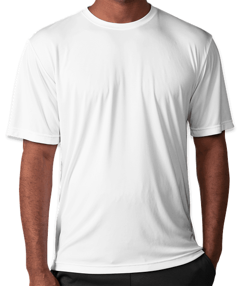
Gildan Softstyle Jersey T-shirt (Everyday Team Tee)
- Fabric: 4.5 oz., 100% ring-spun cotton (heathers are cotton/poly blend)
- Sizes: XS to 5XL
- Placement note: High stitch density gives the flattest surface of any budget cotton tee, which makes screen-printed chest logos and back text come out sharper than on standard Gildan Heavy Cotton
Sport-Tek Competitor Performance Shirt (Athletic Team)
- Fabric: 3.8 oz., 100% polyester with PosiCharge technology
- Sizes: XS to 4XL (tall sizes available)
- Placement note: PosiCharge locks color during washing, so a full-back number or bold chest logo holds its vibrancy through an entire season of laundering
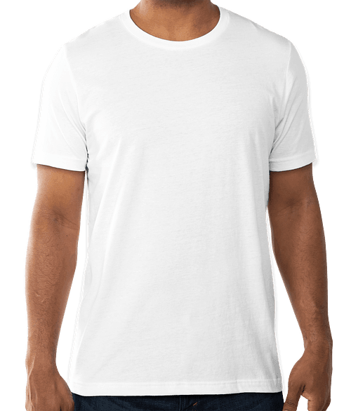
Bella + Canvas Jersey T-shirt 3001 (Retail Fashion Tee)
- Fabric: 4.2 oz., 100% Airlume combed and ring-spun cotton, 32 single
- Sizes: XS to 3XL
- Placement note: Airlume combing removes short fibers and vegetable matter, leaving a flat, smooth surface that makes DTG-printed fine type and sleeve logos reproduce with retail-grade sharpness
Design Tips for Shirts the Whole Team Will Actually Wear

We’ve seen it happen on both sides: a group invests in great shirts and everyone reaches for them on game day. And we’ve seen the opposite, where the shirts come back with “mine ended up in the donate pile” on a reorder inquiry. The difference is almost never budget. It’s the handful of design decisions that happen before the order is placed.
Our 2026 Swag Trends Survey found 74% of organizers list “team unity and belonging” as the primary outcome they want from custom apparel. These tips protect that outcome.
- Contrast is non-negotiable. Light ink on dark shirts and dark ink on light shirts read clearly from across a room. Navy on black, light gray on sport gray, and ice gray on white all fight the eye. If you’re unsure, preview the design in grayscale first.
- Cap ink colors at three for screen printing. Each color requires its own screen setup. Three covers most logos cleanly. If you need a full-color photo or gradient, use digital printing instead, which handles unlimited colors at no added per-color cost.
- Match the print method to the artwork style. Bold 1- to 3-color logos go to screen printing for durability and opacity on dark fabrics. Complex gradients, small body text, and photo-realistic art go to digital printing for color fidelity.
- Keep all type at 0.25 inches or taller. That is the minimum height at which most typefaces hold their internal shapes through the printing process on cotton or polyester. Below that, counters (the enclosed spaces inside letters like O and P) fill in.
- Use vector files whenever possible. AI, SVG, and EPS files scale without pixelation. If you are uploading a raster file (JPG or PNG), it should be at minimum 300 DPI at the intended print size. Our design team will flag undersized files during the proof review.
- Let people pick their own size. Our group order form lets everyone choose their size, color, and shipping address individually. It removes the sizing spreadsheet that slows down nearly every group order and is the most common thing organizers tell us saved them time.
- Show the draft to two people outside the design committee. If they pause to read the text, the type is too small or too complex. If they immediately understand the design, you are done. The shirt has to work in a second, not a minute.
Start With a Design Your Team Will Be Proud to Wear
Font pairing, logo placement, and fabric choice each work independently, but they work best together.
A bold Bebas Neue headline on a Gildan Softstyle left-chest placement, reproduced via screen print, looks like a real brand. A hairline script crammed onto the front of a poly performance tee disappears.
Our Design Lab gives you the tools to build it right, and our design team reviews every order before it prints. Ready to outfit your group with custom t-shirts that the whole team will actually reach for? Open a template above or start from scratch in the Design Lab.
Frequently Asked Questions
Q: What fonts work best for custom t-shirt printing?
Bold sans-serif fonts like Bebas Neue, Impact, and Montserrat are the most reliable choices for custom t-shirt printing. They reproduce cleanly at multiple sizes across both screen and digital printing, and they read clearly at distance. Pair one bold display font for your headline with one neutral body font for names or dates. Avoid hairline scripts in anything smaller than 0.25 inches printed height, as thin strokes often partially fill in on cotton weaves during screen printing.
Q: Where should I put my logo on a shirt?
For company and staff shirts, a 3 to 4 inch logo on the left chest, centered about 7 to 9 inches below the shoulder seam, is the professional standard for custom t-shirt design. For event tees and spirit wear, a 10 to 12 inch graphic across the center chest or full back maximizes visibility. The most versatile combination is left-chest brand mark plus full-back message, which works for everything from company retreats to charity 5Ks.
Q: How do I create a shirt design if I’m not a designer?
Start in our Design Lab. Pick any of the hundreds of templates organized by sport, event type, and industry, then swap in your text and colors. You can also upload a logo directly and the lab will render it on the actual product in real time. If you get stuck, our Inkers are available to clean up your artwork or build a fresh design from your idea at no extra charge.
Q: What is the difference between screen printing and digital printing for text on custom t-shirts?
Screen printing pushes ink through a mesh screen, one layer per color, onto the fabric. It produces thick, vibrant, highly durable prints ideal for bold type and 1 to 3 color custom t-shirt designs in large quantities. Digital printing (DTG and DTF) sprays ink directly into the fabric with no per-color setup, making it the right choice for full-color artwork, photography, fine type, and smaller runs. For most team font treatments (solid, bold, few colors), both methods produce excellent results.
Q: Can I mix fonts on a team shirt design?
Yes, two fonts is the standard for custom t-shirt design. Use one bold display font for the main headline (team name, slogan, event) and one clean body font for supporting details (names, dates, website). Three or more fonts compete visually and make the design feel crowded at distance. A good pairing example: Bebas Neue for the main name, Montserrat Regular for the year or tagline below it.

The Custom Ink Staff is a team of design enthusiasts and promo product experts dedicated to bringing your ideas to life. From screen printing secrets to the latest trends in custom gear, we draw on decades of collective experience to help you create something unforgettable.