7 Logo Types Explained & When To Use Them: Which Designs Print Best on Apparel, Uniforms, and Merch
 Posted By Custom Ink Staff —
The Custom Ink Staff is a team of design enthusiasts and promo product experts dedicated to bringing your ideas to life. From screen printing secrets to the latest trends in custom gear, we draw on decades of collective experience to help you create something unforgettable.
SHARE:


Choosing the right logo style can make or break your custom apparel project. Whether you’re ordering team uniforms, fundraising shirts, or company merch, understanding how different logo types print on fabric helps you avoid surprises and create gear your group will actually be proud to wear. If you already have a logo and you’re just not sure it’ll print the way you’re imagining it, you’re in the right place.
The short answer: wordmarks, lettermarks, pictorial marks, and simple combination marks print most reliably because they use bold shapes and limited detail. The best choice depends on your group’s needs, your print method, and where the logo lives on the garment.
At Custom Ink, we’ve spent 25 years helping organizers choose logos that print beautifully, and with our Design Lab and free design review, we’ve got your back every step of the way. Read on to learn about the 7 types of logos and how to make yours shine, whatever the product and whatever the occasion.
In This Article
- 1. Wordmark
- 2. Lettermark
- 3. Pictorial Mark
- 4. Abstract Mark
- 5. Combination Mark
- 6. Emblem or Badge
- 7. Mascot or Character
- Which Logo Types Print Best on Custom Apparel?
- Printing Methods and Logo Compatibility
- How to Make Sure Your Logo Prints Well on Merch
- Which Logo Types Work Best on Hardgoods and Promo Items
- Modern Logo Formats Worth Knowing
- Frequently Asked Questions
Key Takeaways
- Wordmarks, lettermarks, and pictorial marks print most reliably — bold shapes and limited color count maintain clarity across screen printing, embroidery, and heat transfer, especially at small placements like left chest or cap.
- File format determines print quality before production even starts — vector files (AI, EPS, SVG) scale without losing quality; raster files (JPG, PNG) can blur when enlarged, so starting in vector puts you ahead of most common print problems.
- High contrast beats color variety every time — limited-color, high-contrast logos print more crisply, cost less to reproduce across decoration methods, and hold up better over repeated washing.
The 7 Logo Types and How to Design Them
1. Wordmark Logos
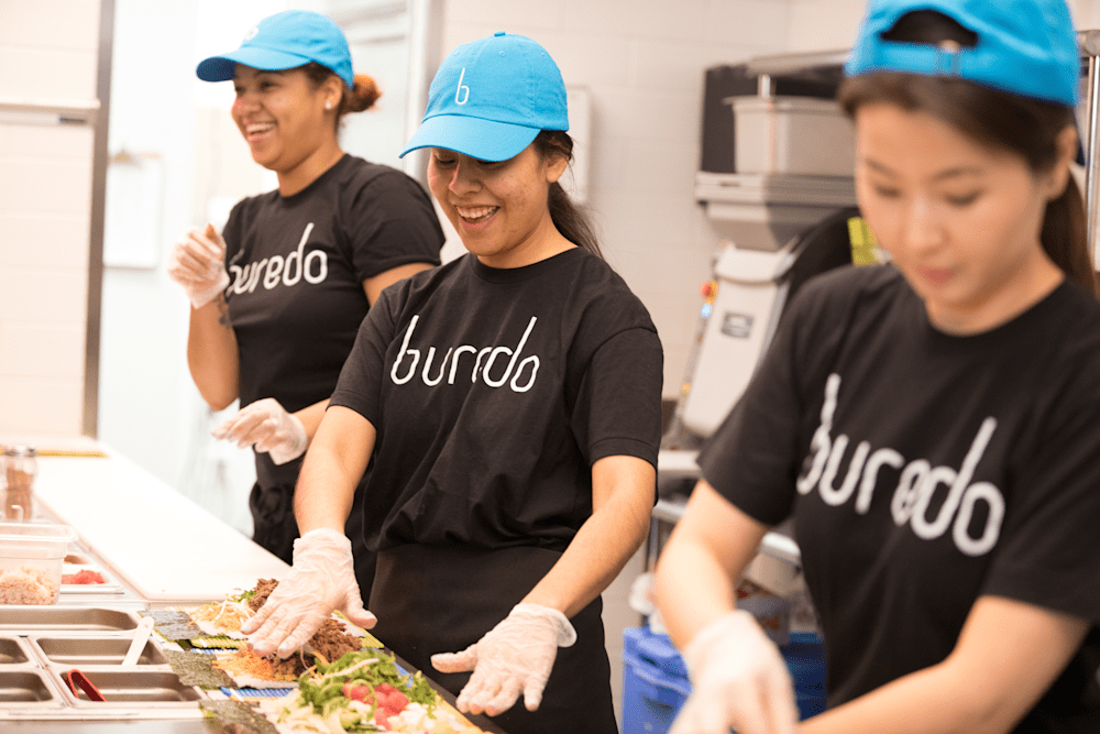
A wordmark, or logotype, is a logo made entirely of a brand or organization name set in a distinctive, custom typeface. There’s no separate icon — the typography itself carries the identity.
Coca-Cola’s Spencerian script is one of the most recognizable wordmarks in history. Font choice sets the logo’s tone and authority. Because there’s no logo, the lettering needs to be distinctive enough to make an impression.
Wordmarks focus on legibility and are among the easiest logo types to print on apparel. For custom t-shirts and business uniforms, wordmarks have strong advantages. Clean lines and bold shapes make them ideal for screen printing, and because there’s no icon to lose at small sizes, wordmarks stay readable on left-chest placements, typically 3–4 inches wide. If your organization is new and building name recognition, a wordmark keeps your name top of mind.
Our Design Lab includes a library of fonts and text tools so you can build a clean, confident wordmark without hiring a designer. Experiment with typefaces, preview them on products, and adjust until the look is exactly right for your group. Designing swag should feel fun and empowering, not stressful or confusing.
Wordmark Logo Design Tips
- Choose a clean, confident typeface. Sans-serif fonts or well-balanced serifs with strong letterforms stay legible at small sizes. Overly decorative scripts can read beautifully at large scale but fall apart on a left-chest print or baseball cap.
- Keep to one or two colors. A single primary color with plenty of contrast against the garment ensures readability across screen printing, heat transfer, and embroidery without adding cost.
- Use the Design Lab‘s text tool to test spacing. Letter spacing that looks right on screen can compress at small print sizes. Preview at actual print scale before you commit.
2. Lettermark Logos

A lettermark, or monogram logo, uses one or more initials to represent a brand or organization. Under Armour, for instance, uses an interlocking U and A as their logo. Lettermark logos are especially useful for groups with long names. By shortening a name to initials, lettermarks stay compact, scalable, and clear when print space is limited.
Scaling matters more than most people realize. An effective logo must hold up clearly at both small and large sizes. Lettermarks typically stay legible at around 1-inch wide, the common readability threshold on apparel, making them one of the most reliable logo styles for decorated gear.
Lettermarks also embroider cleanly because block or serif letters translate beautifully to stitching.
Our Design Lab lets you preview your monogram logo on any of our products at scale before placing your order, so you know exactly what you’re getting before production begins.
Lettermark Design Tips
- Avoid decorative fonts. Block or geometric sans-serif letterforms hold up best on caps, sleeves, and small promo items. Thin or ornate letterforms lose definition quickly at stitch size.
- Use a restrained color palette. Black, navy, or a single accent color keeps lettermarks professional and timeless. Adding a full range of colors to a two-letter mark usually works against it.
- Preview at 1 inch in the Design Lab. That’s the common readability threshold for apparel. If the letters blur or crowd each other at that size, adjust the weight or spacing before ordering.
3. Pictorial Mark Logos

A pictorial mark is a logo built around a single, recognizable image or icon. The symbol represents the brand on its own.
Some of the most iconic pictorial marks include Apple and Target. They utilize the same design concept: a bold, minimal mark recognizable from a distance.
For custom apparel, the best pictorial marks use bold, simple shapes that hold their clarity at any size. Pictorial marks with strong outlines and limited colors print best for screen printing and heat transfer. For embroidery, keep the icon at least 1.5 inches wide so details don’t blur together.
If your current icon feels too complex, our design team can help simplify it into a print-ready version that looks sharp on any garment, at no extra cost.
Pictorial Mark Design Tips
- Prioritize closed, bold shapes. Open or hairline outlines risk breaking down in embroidery and small screenprints. Strong, filled shapes with clear edges reproduce consistently across every decoration method.
- Limit to one or two colors. High-contrast marks print crisply and cost less across print methods. If the icon reads clearly in one color, it’ll work everywhere — merchandise, signage, digital, and beyond.
- Keep accompanying text secondary. If your pictorial mark appears alongside your name, use a clean, simple font so the symbol stays the visual focus. Competing type styles split attention rather than build recognition.
4. Abstract Mark Logo
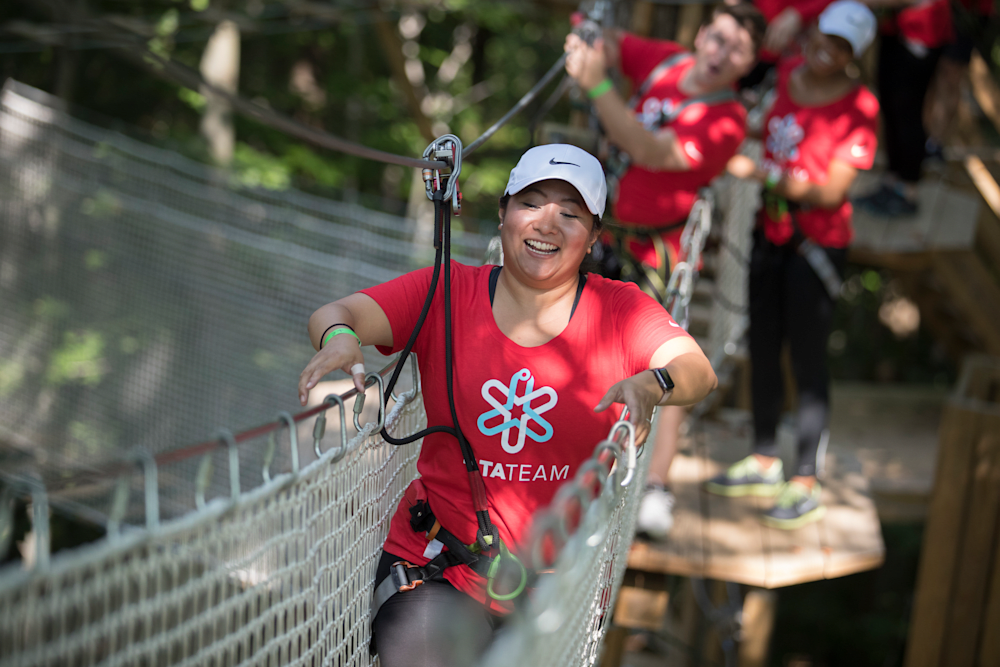
An abstract mark uses a geometric or stylized shape, not a recognizable object, to represent a brand. Nike’s Swoosh is the most famous example. Abstract marks are flexible, print easily in one color, and can suggest ideas like movement, unity, or energy.
Simplicity is a shared trait of the world’s most memorable logos, and it’s exactly what makes abstract marks so printable.
Abstract marks with bold, single-color shapes are straightforward to screen print and scale well for small areas like sleeves or baseball caps. Avoid overly detailed abstractions — thin lines and sharp curves can break down during embroidery. When in doubt, test at stitch size first.
Our clipart library and Design Lab tools let you explore abstract shapes quickly and develop something truly unique for your group.
Abstract Mark Design Tips
- Let color carry the meaning. Because abstract marks don’t rely on recognizable imagery, your color palette does the emotional heavy lifting. Research Loyola College Maryland shows consistent use of brand colors can boost recognition by up to 80% — and abstract marks live or die by that consistency. Choose colors that align with your brand’s tone — energetic, dependable, bold — and use them across all your gear.
- Avoid thin lines and highly complex curves. Intricate shapes can look stunning at large scale but break down during embroidery or degrade in small screen prints. Test the mark at 1-inch wide before finalizing.
- Pair with understated typography. Simple, modern fonts ground an abstract mark and make the overall logo feel intentional rather than experimental. The shape should be the hero; the text supports it.
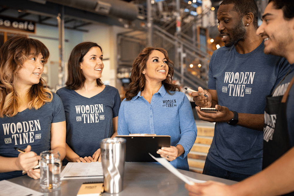
5. Combination Mark Logos

A combination mark pairs a symbol or icon with a wordmark, joined as one logo. This is one of the most common logo styles for teams, schools, and nonprofits, because it’s flexible. You can use the full version on the chest and the icon alone on a shirt sleeve or hat.
The text builds name recognition; the icon gives you a visual anchor that travels anywhere. Here’s how the two versions typically divide across placements:
| Full Lockup | Icon Only |
|---|---|
| Center chest | Left chest |
| Back of shirt | Sleeve |
| Banners | Cap |
| Large signage | Small promotional items |
Combination marks print well for screen printing and DTG as long as the icon isn’t too detailed. For embroidery, a simplified icon version works best in smaller areas. Our group ordering platform lets every member preview the logo on their chosen product and size, so organizers know exactly how the mark looks before a single shirt is produced.
Combination Mark Design Tips
- Use contrast to keep both elements readable. A bold primary color for the icon and a more neutral tone for the text tends to work well across different layouts and garment colors. When both elements compete at equal weight, neither wins.
- Set a spacing rule early. A consistent gap between the icon and text prevents the mark from looking crowded at different sizes. Decide on that proportion in the Design Lab and hold it across every version you produce.
- Design the icon to stand alone from the start. The combination mark works because each half is independently usable. If the icon only makes sense next to the text, the full flexibility of this logo type is lost.
6. Emblem or Badge Logos
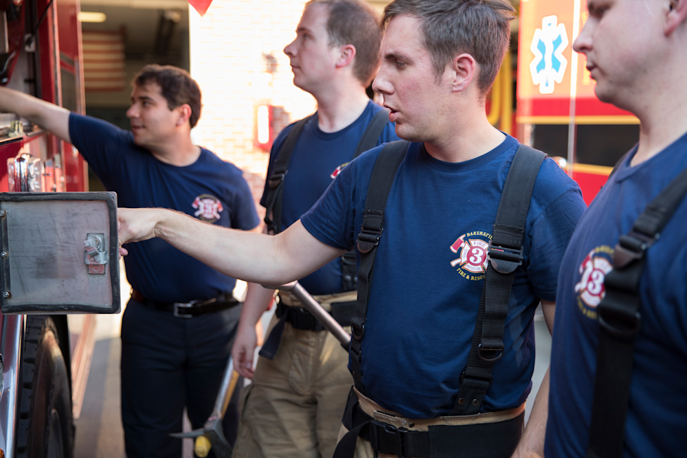
An emblem or badge logo places text inside a border, shield, or seal — think vintage crests, fire-department patches, or university seals. These logos convey tradition and group pride. Their detail, though, can make them harder to reproduce clearly on small garments.
Lamborghini’s logo with the raging bull inside a shield shows how much visual weight a small shape can carry. It also shows how much can go wrong when you try to shrink that detail onto small surfaces.
In practice, thin lines, small text, and multi-color gradients often break when resized for shirt sleeves, caps, or promotional items. Embroidery handles simpler badge shapes well, but intricate crests can become unreadable below 3-inches. Screen printing works when you adapt to thicker lines and a limited color count.
Always create a simplified version of any emblem for small placements. Our Design Lab generates a proof before checkout, so you can catch those issues early, before production, not after.
Emblem and Badge Design Tips
- Match font style to the emblem’s tone. Classic serifs or slab fonts reinforce heritage and authority. Cleaner sans-serif lettering can modernize an emblem without losing credibility. Either way, the type needs to stay readable inside the badge shape at small sizes.
- Keep lines thick enough to survive embroidery. Fine details under 1mm risk disappearing at stitch size. If the emblem has thin interior lines, a border, or small interior text, test a simplified version at 2–3 inches before ordering.
- Plan two versions from the start. Create a full badge for large placements (center chest, back, signage) and a reduced mark (icon or initials only) for caps, sleeves, and small promotional items. Building both early prevents compromises later.
7. Mascot or Character Logos

A mascot or character logo uses an illustrated figure — a person, animal, or creature — as a team or brand symbol. Mascots are expressive and memorable, popular with sports teams, schools, and youth organizations. They’re also the logo type that takes the most planning to print well.
Consistent use over time is what turns mascots into cultural icons. The more consistently a mascot appears across your gear, the more powerful it becomes.
Printing mascots takes some thought. DTG and sublimation can handle detailed, full-color mascots, though they may cost more and wear faster on some fabrics. Screen printing mascots means limiting the design to a few spot colors. For embroidery, simplify — we recommend at least 3 inches wide and no more than six to eight thread colors for clean results.
Our designers have spent 25 years turning detailed mascot art into print-ready files. They can create simplified versions optimized for each decoration method, at no additional design cost.
Mascot Design Tips
- Use warmer, expressive colors — but keep them printable. Brighter palettes bring mascots to life, especially for youth and family audiences, but limit to 4–6 spot colors for screen printing so the design stays cost-effective at volume.
- Balance the mascot against the brand name. Friendly, rounded typography works well alongside illustrated characters. The mascot should draw the eye first; the name should be immediately readable second. If both compete, neither lands.
- Always design a simplified flat-color version. The full illustrated mascot works on center chest and back prints. For caps, sleeves, and small promo items, you need a stripped-down version with fewer colors and no fine detail. Design both at the same time — it saves a round of revisions later.
Which Logo Types Print Best on Custom Apparel?

Wordmarks, lettermarks, pictorial marks, and simple combination marks print most reliably on apparel. This is because they use bold shapes and limited detail, maintaining clarity across screen printing, embroidery, and heat transfer. Emblems and mascots can look amazing — they just often need some simplification for smaller placements.
| Logo Type | Print Reliability | Best Print Methods | Ideal Placements | Best For |
|---|---|---|---|---|
| Wordmark | High | Screen print, heat transfer | Center chest, back | Teams, clubs, businesses |
| Lettermark | High | Embroidery, screen print | Left chest, cap, sleeve | Organizations with long names |
| Pictorial mark | High | Screen print, DTG, embroidery | Center chest, back, cap | Established brands, sports teams |
| Abstract mark | High | Screen print, heat transfer | Anywhere | Startups, fitness groups |
| Combination mark | High (if simplified) | Screen print, DTG | Center chest, back | Schools, nonprofits, sports teams |
| Emblem/badge | Medium | Embroidery, screen print (simplified) | Left chest, cap | Fire/police, universities, formal orgs |
| Mascot/character | Low–Medium | DTG, sublimation | Center chest, back | Youth sports, school spirit wear |
Color matters, too. High-contrast, limited-color logos are almost always the best choice for custom merch. They print crisply, cost less to reproduce, and look sharp across every decoration method. The WWF’s black-and-white panda is a perfect example: simple palette, instant recognition, and easy to print on anything.
Our Design Lab gives you a real-time preview of how your logo will appear on your product, so you can make smart, confident choices before production ever begins.
Which Printing Method Is Right for Your Logo? 5 Options Explained
Understanding how each printing method handles different logo styles helps you make the right call and avoid reprints for your custom apparel. Here’s what you need to know.
Screen Printing
Screen printing is built for bold designs with clear color separation. It works beautifully for wordmarks, lettermarks, pictorial marks, and simplified combination marks. It’s not the right tool for detailed mascots or photographic gradients, but it’s incredibly cost-effective for bulk orders. The more you print, the lower the per-piece price.
Embroidery
Embroidery adds texture and a premium feel that’s hard to beat on polo shirts, jackets, and hats. It works best for lettermarks, small pictorial marks, and simplified emblems. Thread has physical limits — fine lines under 1mm and color gradients don’t translate well. Stick to eight colors or fewer for the cleanest results.
Direct-to-Garment (DTG)
DTG is your best friend for detailed, color-rich artwork. It prints full-color mascots and emblems with ease and is ideal for shorter runs. Keep in mind it can wear faster with frequent washing on some fabrics, so it’s worth discussing with our team before you commit.
Heat Transfer / Vinyl
Heat transfer is a great fit for simple one- or two-color logos, wordmarks and abstract marks especially. It’s durable, affordable for smaller quantities, and holds up well over time.
Sublimation
Sublimation allows full-color, edge-to-edge printing on polyester. It’s the go-to for mascots and detailed combination marks on jerseys and athletic wear, and the results are stunning.
| Print Method | Best Logo Types |
|---|---|
| Screen printing | Wordmarks, lettermarks, pictorial marks, abstract marks, simple combination marks |
| Embroidery | Lettermarks, small pictorial marks, simplified emblems |
| DTG | Mascots, detailed combination marks, full-color emblems |
| Heat transfer | Wordmarks, abstract marks, simple icons |
| Sublimation | Mascots, detailed combination marks, full-color designs |
Our design team helps you choose the right method for your logo and fabric, and every order comes with transparent, all-inclusive pricing and our satisfaction guarantee.
How to Make Sure Your Logo Prints Well on Custom Merch
You don’t need to be a designer to get your logo print-ready. Follow this checklist and you’ll be in great shape.
- Start with a vector file. Vector formats (AI, EPS, SVG) scale without losing quality. Raster files (JPG, PNG) can blur when enlarged. If your logo lives in vector format, you’re already ahead of the game.
- Create single-color and simplified versions. Every logo should have a one-color option for screen printing and a stripped-down version for small placements like sleeves, caps, and tags.
- Test at actual print size. Logos should stay readable at around one inch wide. If small details disappear, simplify before you order.
- Choose a high-contrast palette. Pick colors that stand out against your garment color. Dark logo on a light shirt, light logo on a dark shirt — that’s where the magic happens.
- Match the method and fabric. Dark fabrics may need a white underbase for screen printing. Stretchy fabrics need stabilizer backing for embroidery. Our team knows all of this by heart.
- Upload to our Design Lab. Preview your logo on the actual product, adjust size and color, and see exactly what you’re getting before you place your order.
- Get a free design review. Our design experts will flag and fix issues before production, because getting it right matters more to us than getting it fast.
Pro tip: Share your Design Lab preview link with teammates or group members before ordering. Getting buy-in upfront means everyone’s excited when the gear arrives.
Looking for more guidance on the design fundamentals behind a strong logo — including color psychology, file formats, and what makes logos work across print and digital? Our logo design ideas guide covers the core elements of effective logo design, alongside industry-specific recommendations for service businesses, retail, and manufacturing.
Which Logo Types Work Best on Hardgoods and Promo Items

Apparel is one piece of the picture. Many groups ordering custom t-shirts are also ordering drinkware, tote bags, notebooks, and promotional items — and logos behave differently on hard surfaces than on fabric. The same design that prints beautifully on a center chest can fall apart on a pen or a 12oz tumbler. Here’s how to think about logo type by product category.
Drinkware (Tumblers, Mugs, Water Bottles)
Drinkware is one of the highest-visibility hard goods categories because people use it daily. The decoration method determines which logo types work best.
- Laser engraving removes color entirely, leaving a clean etched mark. Lettermarks, simple wordmarks, and bold pictorial marks work best — fine detail and thin lines don’t engrave cleanly at drinkware scale.
- Pad printing applies ink to a curved surface, which is how most flat logos end up on mugs and bottles. Wordmarks and simple combination marks print well; complex mascots and detailed emblems can smear or lose definition on a curved surface.
- Wraparound prints on tumblers give you more real estate and can handle more detail — a great format for combination marks or a mascot with a simplified color count.
Tote Bags
Tote bags print much like apparel — screen printing is the most common method, and the same rules apply. Bold shapes, limited colors, and clean lines reproduce most reliably. The main difference is surface texture: canvas and non-woven bags have more texture variation than a smooth jersey, which can soften fine details. Combination marks and pictorial marks with strong outlines are reliable choices. Avoid thin script wordmarks and complex mascots without a simplified version ready.
Notebooks and Journals
Notebooks are typically decorated through debossing (pressing the design into the cover) or foil stamping. Both methods reward simplicity — bold shapes hold up well, fine detail compresses or disappears. Lettermarks and clean wordmarks are the strongest performers here. Emblems and combination marks work if the detail is stripped back. Mascots with lots of internal line work are a poor fit for debossing.
Promotional Items (Pens, Keychains, Small Accessories)
Small promo items have the tightest print area constraints of any product category. Pad printing is standard, and the print surface is often smaller than a square inch. Lettermarks are almost always the right call — they’re built for exactly this situation. Simple wordmarks work if the name is short. Anything with detail, gradients, or multiple colors will lose definition and look muddy at this scale. If your main logo is a detailed mascot or emblem, this is where the simplified version earns its place.
| Product Type | Common Method | Best Logo Types | Avoid |
|---|---|---|---|
| Tumblers / water bottles | Laser engraving, pad print, wraparound | Lettermarks, wordmarks, simple pictorial marks | Fine-line mascots, multi-color emblems |
| Mugs | Pad printing | Wordmarks, simple combination marks | Complex mascots, detailed emblems |
| Tote bags | Screen printing | Combination marks, bold pictorial marks | Thin script wordmarks, detailed mascots |
| Notebooks / journals | Debossing, foil stamping | Lettermarks, clean wordmarks, simplified emblems | Mascots with fine interior detail |
| Pens / small promo items | Pad printing | Lettermarks, short wordmarks | Multi-color logos, detailed marks of any type |
The through-line across all hardgoods: the smaller the print area and the more tactile the surface, the more your logo needs to simplify. A responsive logo system — with a full version, a simplified icon, and a one-color option ready to go — means you’re never scrambling to adapt a complex mark at the last minute. Our design team can help you build those versions alongside your main logo, at no additional cost.
Choosing the Right Logo Style for Your Group

For most teams and fundraisers, a combination mark or a simple pictorial mark gives you the best balance of recognition, flexibility, and print clarity. Wordmarks are a smart choice for newer organizations still building their name. Here’s how to think about it by group type.
Youth and School Sports Teams
Mascots are popular — and they should be. But they need to be simplified for printing. A combination mark (mascot icon + team name) gives you the most flexibility: full version on the chest, icon on the cap. Keep logos legible at 2–3 inches, and you’re set for every placement on every piece of gear.
Nonprofits and Fundraisers
Wordmarks and pictorial marks are budget-friendly because they use fewer colors. A limited palette keeps printing costs down while keeping your mark recognizable, and that means more money going toward your cause. Our fundraising platform lets groups sell shirts online with no upfront cost, making it even easier to raise funds without the risk.
Greek Organizations and Clubs
Lettermarks are a natural fit for Greek letters — they’re designed to be displayed as initials. Emblems work beautifully for formal events but should be simplified for everyday products. One design system, adapted for every moment.
Corporate Teams and Staff Uniforms
Lettermarks and combination marks project exactly the right level of polish. An embroidered left-chest logo is the standard for workwear — clean, professional, and consistent across your whole team. That sense of shared identity is worth more than most organizations realize.
For service businesses, trades, retail stores, and manufacturing companies, our logo design ideas guide goes deeper on industry-specific recommendations and how to get your logo working across every surface. Or jump straight into the Design Lab to see how your logo looks on the gear you’re considering.
Modern Logo Formats Worth Knowing

Most groups do fine with one of the seven logo types above. But logos rarely live in just one place. As your gear line and online presence expands, a flexible logo system starts to matter. Here are three modern format considerations worth building into your thinking from the start.
Animated Wordmarks
An animated wordmark brings your logo to life through motion — letters sliding into place, a reveal effect, or a subtle pulse. For groups producing event recap videos, social content, or digital ads, a simple animation makes a brand feel polished and current. The key constraint: the animation is digital-only. Your logo still needs a static version that works everywhere print lives. If the logo only looks good when it’s moving, the static version needs more work.
- Best for: Groups with active social channels, event organizers producing video content, organizations with a strong digital presence alongside their physical merch
- Print consideration: Always design and approve the static version first — that’s the version going on your shirts, hats, and tote bags
Negative Space Marks
A negative space logo uses the background to form part of the symbol — a hidden shape or letter within the mark itself. When well-executed, these feel clever and memorable. For custom apparel specifically, they work especially well in single-color applications: one-color screen prints, embroidery on solid garments, or debossed heat transfers. The design challenge is that the hidden element must survive at small print sizes. If it disappears at 2 inches, it’s not doing its job.
- Best for: Groups that want a distinctive mark without relying on multi-color printing — particularly useful for embroidery and one-color promotional items
- Print consideration: Test at actual embroidery or print size before finalizing. If the negative space detail disappears, enlarge the element or simplify the design
Responsive Logo Systems
A responsive logo system is a set of pre-approved logo versions designed to work at different sizes and contexts: the full lockup for center chest and back prints, a simplified icon for cap and sleeve placements, a one-color version for dark garments, and a stacked version for square formats like social avatars.
This doesn’t require multiple logos — it’s one identity, adapted intelligently. Groups that build this system from the start avoid the scramble of trying to retrofit a complex mark onto a small promo item six months later.
- Best for: Any group ordering across multiple product types — t-shirts, hats, bags, drinkware, and promotional items — where the logo will live at very different sizes
- How we help: Our design experts can help you build simplified and one-color versions of your mark alongside the full version, at no additional cost — so your logo works beautifully on every piece of gear you order
Frequently Asked Questions
What logo qualities improve print clarity on apparel?
Simplicity, high contrast, bold shapes, and limited colors are your best friends. Logos with clean lines and minimal fine detail print sharply across screen printing, embroidery, and heat transfer, especially for smaller placements like left chest or caps. When in doubt, simplify.
Which logo types work best for embroidery versus screen printing?
Lettermarks, small pictorial marks, and simple emblems embroider beautifully because thread handles bold shapes and limited colors best. Screen printing is more flexible and works well for wordmarks, abstract marks, and combination marks with flat, solid colors. Our team can help you figure out which method is right for your specific logo.
How can I simplify my logo for smaller print areas?
Remove fine details, use one or two colors, and avoid text smaller than one inch. Create a standalone icon version so the mark stays readable on sleeves, caps, and small items. Our design team can do this for you at no additional cost.
What file formats should I provide for custom apparel printing?
Vector formats like AI, EPS, or SVG are ideal because they scale without losing quality. Raster files like PNG or JPG should be at least 300 DPI at the final print size. Our Design Lab accepts most formats, and our team will review your file and flag any issues before production begins.
How do colors affect logo printing on different fabrics?
Contrast between logo and fabric is everything. Dark logos on light shirts and vice versa print best. Fewer colors reduce screen printing costs and simplify embroidery. On dark fabrics, screen printing may need a white underbase, which can shift colors slightly. Always preview on the actual garment color in our Design Lab before you order, so what you see is exactly what you get.

The Custom Ink Staff is a team of design enthusiasts and promo product experts dedicated to bringing your ideas to life. From screen printing secrets to the latest trends in custom gear, we draw on decades of collective experience to help you create something unforgettable.